10:00AM
Blue chip artists, downtown club kids, and Margiela-esque fashion legends. What do they all have in common? Cecilia Dean. For the past three decades, she has invited the world’s best image makers to participate in her conceptual publication, Visionaire. Neither a book nor a magazine, each issue takes a unique form: from , , , custom scented vials, to . Cecilia Dean discusses how what started as an experiment evolved to redefine contemporary art and fashion publishing.
NR
What publications shaped your coming of age?
CD
My first fashion magazine experiences were in the 80s at Sacred Heart Academy—a high school run by bitter old nuns—on Long Island—dreary conservative suburbs I couldn't wait to escape. I had a friend who was much savvier than I was. She would save her money to buy Italian Vogue. We studied it. My friend knew who was who—the photographers, models, and editors. Later on, I was into The Face01 and i-D02. There weren't many American magazines, except Interview03 and .
NR
During high school, you started in Manhattan and then moved to Paris to pursue it full-time (for the likes of Richard Avedon, Steven Meisel, and Irving Penn). After a year of modeling and traveling, you promptly moved back to New York to pursue a degree in English and French literature from Barnard College. Did French literature seem relevant to your experience as a young creative?
CD
I am not sure why I did English and French lit. It's a pretty useless degree if you're not planning on teaching or writing or translating—how ironic that the publication I founded is completely visual. That said, studying language coupled with my intense speech and debate training taught me to communicate clearly and to win arguments—and that's always relevant!
NR
In the early years, what books served as references for Visionaire?
CD
We were looking more at magazines. Everyone thinks we referenced Flair (by Fleur Cowles), but we actually didn't know about it until after Visionaire came out. We all looked at i-D, The Face, Egoiste, The Manipulator04. But, we didn’t have a magazine that represented New York.
It was a different time. Back then, I learned layouts with (look it up). We did not bind the early issues, because it was an added cost. Remnants of paper were cheaper at the printer, because it wasn't an order item. So the paper in the early issues05 would differ from white to tan, kraft, newsprint, onionskin. We worked with a porn printer, because they gave us the best price and had really good skin tones. The printer would give us stacks of each page, and we’d the issues with our friends. It was very hands-on. And it still is—that is the nature of Visionaire editions.
In 1991 (Fool's Day, or April 1, to be exact) we published our first , which was free of ads, for sale at $10, in an edition of 1,000 hand-numbered copies. It was an ode to our creative community. All our friends were doing amazing work that didn't get featured in commercial magazines, which were the only magazines that existed (there wasn't independent publishing as we know it now yet). It was too hard and expensive for these creatives to self-publish. These images needed a home; that was Visionaire. When we showed the first issue, he said it reminded him of Gazette Du Bon Ton06 from the late 1910s and ‘20s, which was also unbound and had beautiful fashion illustrations.
NR
What obsessions would be revealed by your library?
CD
My library is exclusively art books. I would not call myself “obsessed” by anything.
NR
What do you read now?
CD
I read mostly nonfiction. Once I finish a book, I give it away to a friend to read and ask that they pass it along. I don’t believe in keeping paperbacks.
NR
Through fashion, how did Visionaire reflect what was going on in the larger picture of society, economy, and social values of the early 90s?
CD
It was a weird, diverse time—90’s coming off the 80’s. We came of age during the excess of the 80s: , and , and , and the birth of the supermodels, but then came the totally radical from Belgium like and , and like , and then the weirdness of Comme des Garçons07 coming out of Japan08... all colliding in Paris. And then that segued into and . These were radical new ways of expression and seeing the world. And that fashion was reflected in image-making, with the young emerging photographers like Corinne Day, Mario Sorrenti, David Sims, Glen Luchford, Craig McDean... It was mind-blowing. It was this irreverent, youthful revolt against establishment. It was thrilling. And we were right there publishing it.
NR
The New York Times said, ‘Among those toying with the boundaries of fashion and art during the last 20 years, few stand out more than Cecilia Dean and James Kaliardos’. You are well known for merging the worlds of art and fashion, which is now considered mainstream. What were you trying to communicate through blending the two genres? What issue of Visionaire was instrumental in establishing this point of view?
CD
Historically—and surprisingly—there had not been much intersection between the art and fashion worlds. They have been very separate businesses with different rules and different players. A fashion magazine might write about art, but would not have an artist do a fashion shoot. An art gallery would show art, but not fashion photography. For us, it was all about great images, so we didn't make that distinction in Visionaire. Now, almost 30 years later, there is a lot more fluidity.
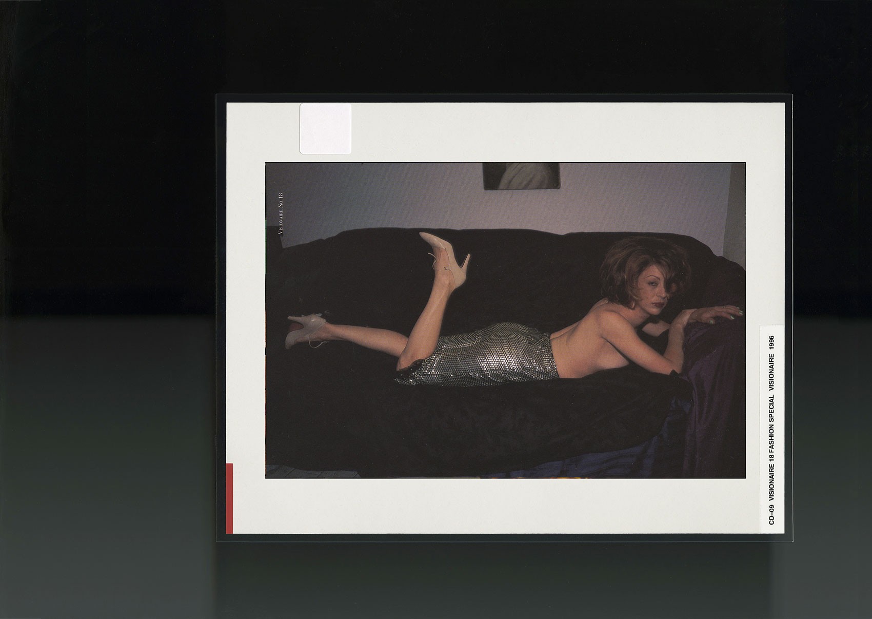
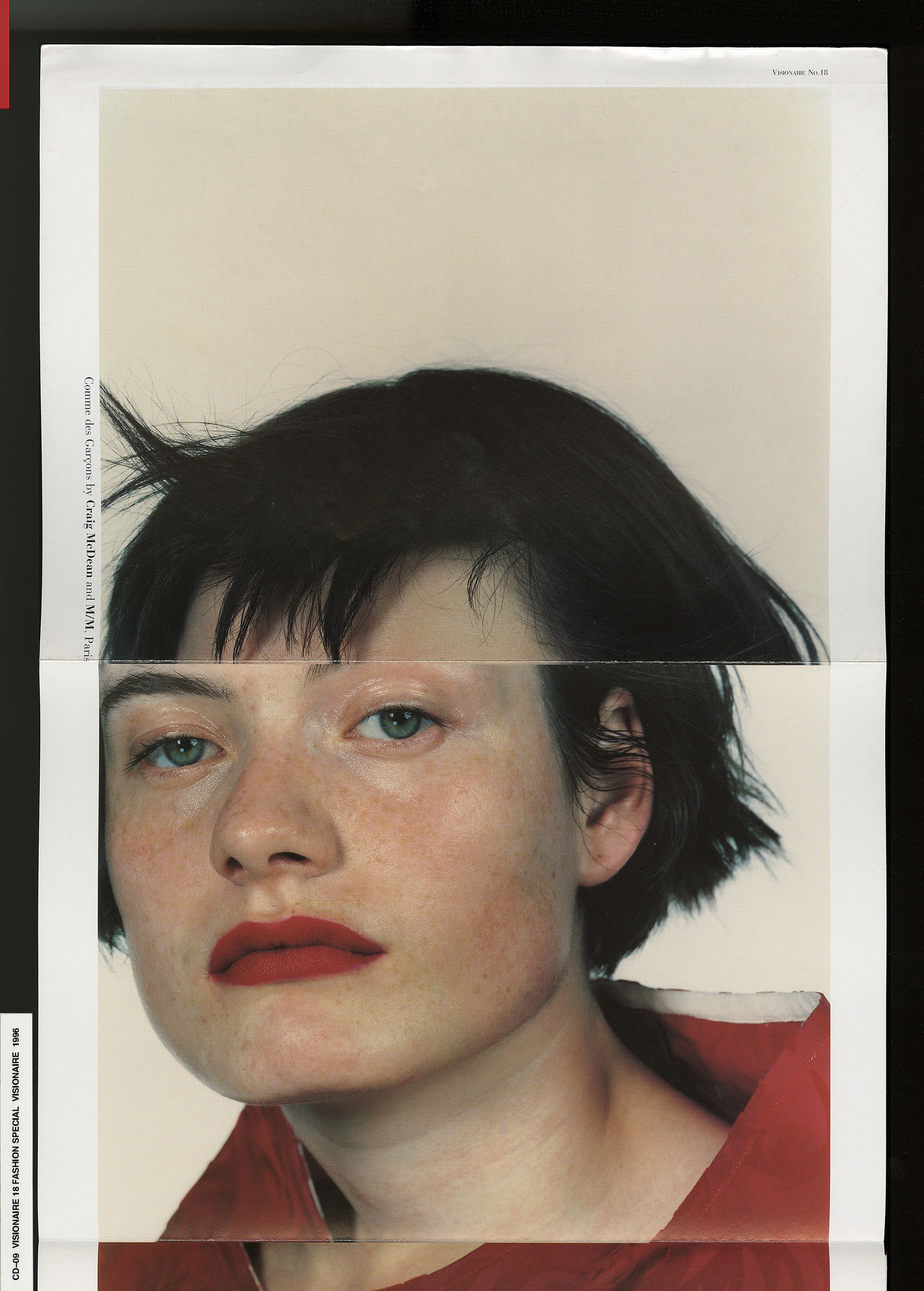
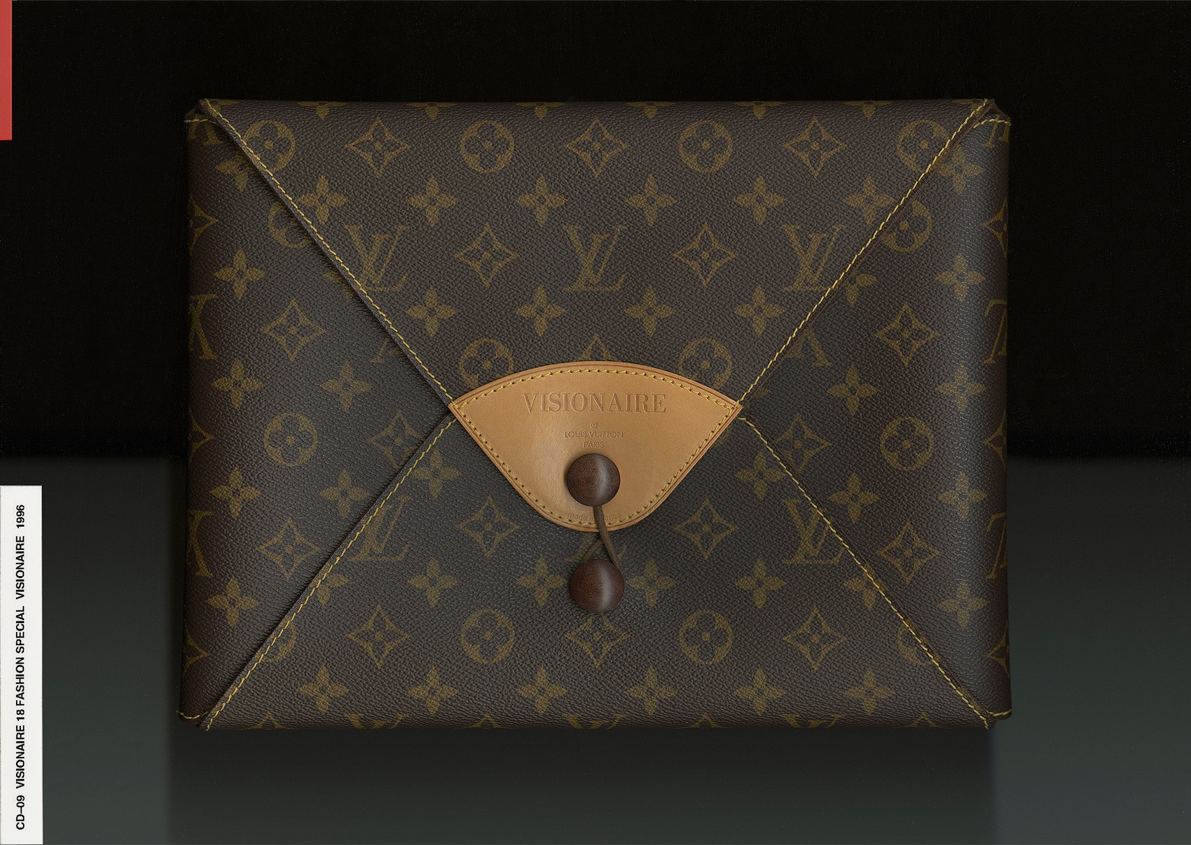
A real turning point for us was Visionaire 18 Fashion Special09. The issue was compiled of 45 "portfolios" of 4–8 pages each by one photographer/artist shooting one designer. This set-up was already kind of radical, as magazines did not shoot total designer looks. To package all these loose portfolios, we approached Louis Vuitton (at the time, they were still a luggage company—they had not yet hired to start their fashion). We sent a fax (this was pre-Internet) to the vice president of Louis Vuitton, and within a couple of months, 2,500 custom Visionaire LV envelopes arrived by FedEx.
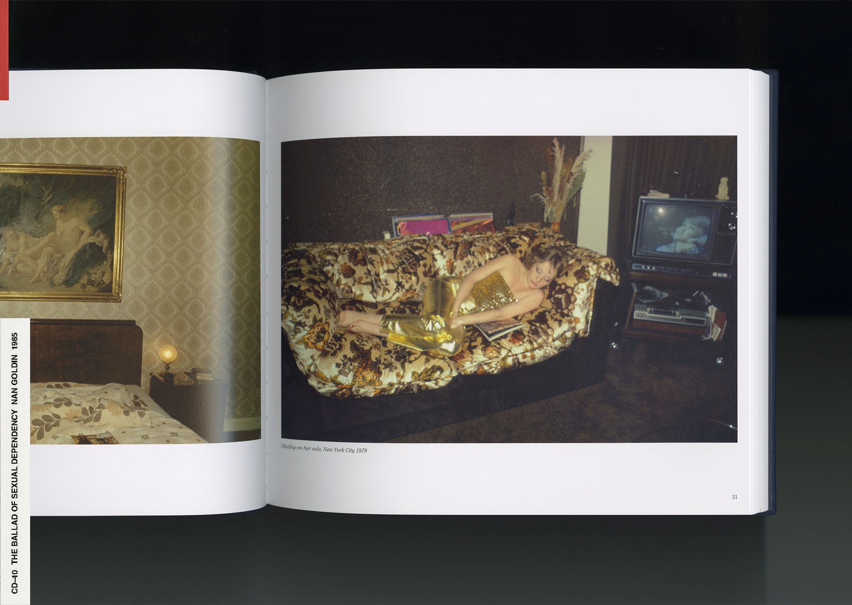
A landmark series was from art photographer Nan Goldin and fashion designer Helmut Lang. We knew that each admired the other, so we asked them to collaborate on a shoot together. For the shoot, Nan cast friends and lovers of all types from ages seven to 53—they lay sprawled on beds, in the back of a cab, or on a New York . This atmosphere was characteristic of Nan’s underground art community which she documents in her work, particularly reminiscent in her book The Ballad of Sexual Dependency10. Nan's uncensored pictorial diary created a natural collaboration with Helmut's spare jackets, t-shirts, and smock dresses. At the time, photographers who worked with fashion were limited by how to show the clothes in the best way. We wanted to create an environment where they could be true to their own vision.
The following year, Marc Jacobs was appointed to be LV’s first ever ready-to-wear designer, who followed the tradition of art and fashion collaborations from Takashi Murakami to Richard Prince.
NR
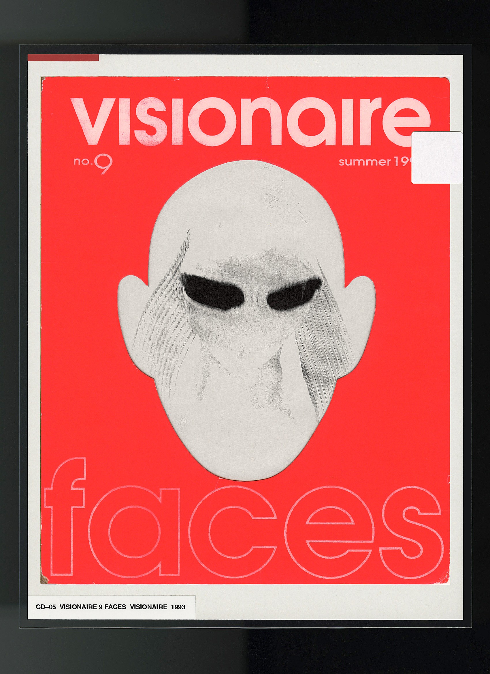
Far from a magazine, the format of Visionaire is completely different every time, introducing concepts and materials that are often foreign to the publishing world. The 2006 edition Visionaire 47 Taste11 poses the question ‘what does an image taste like’? The publication contains 12 original flavors in the form of fast-dissolving breath-strips that correspond to images printed in an accompanying book.
What was the process like working with artists to create 'tastes' of their imagery?
CD
One of the 12 artists we worked with was Jenny Holzer12. Working with her was really funny, it was very abstract what she wanted—the taste of “adrenaline”. She created the corresponding image by designing lyrics from a heavy metal song. She wanted the taste to be toxic. The taste was composed of a lot of menthol, so it really explodes in your mouth, but then there's this weird tingling sensation that stays on your taste buds for a long time afterward. It tastes totally toxic like you are eating poison. It definitely wakes you up; the essence of adrenaline, toxicity, and heavy metal is so perfectly encapsulated in her taste and artwork.
The irony is that developing this toxic taste is like the antithesis of a flavorist’s training. They’re tasked with making everything taste good, not bad.
I remember meeting Jenny Holzer at Art Basel Miami Beach when we were doing our “Taste Bar” for the issue launch. And she told me she actually didn't want to do the project, so she decided to come up with an impossible flavor. She thought there was no way we would to be able to accomplish this, but then we did, and she was really impressed.
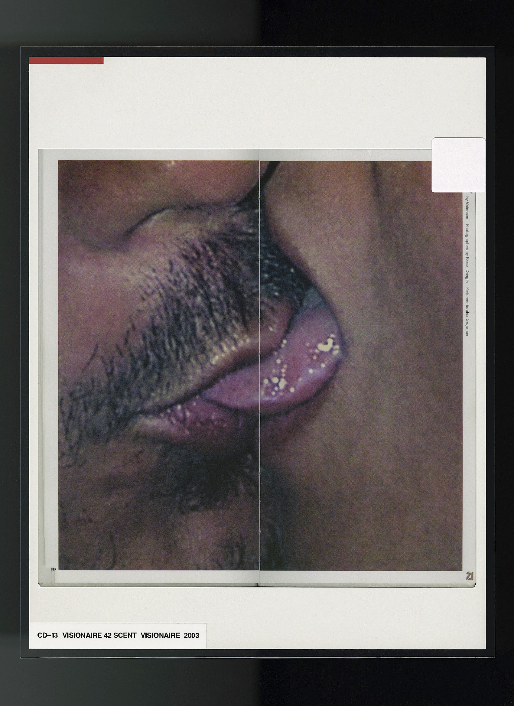
NR
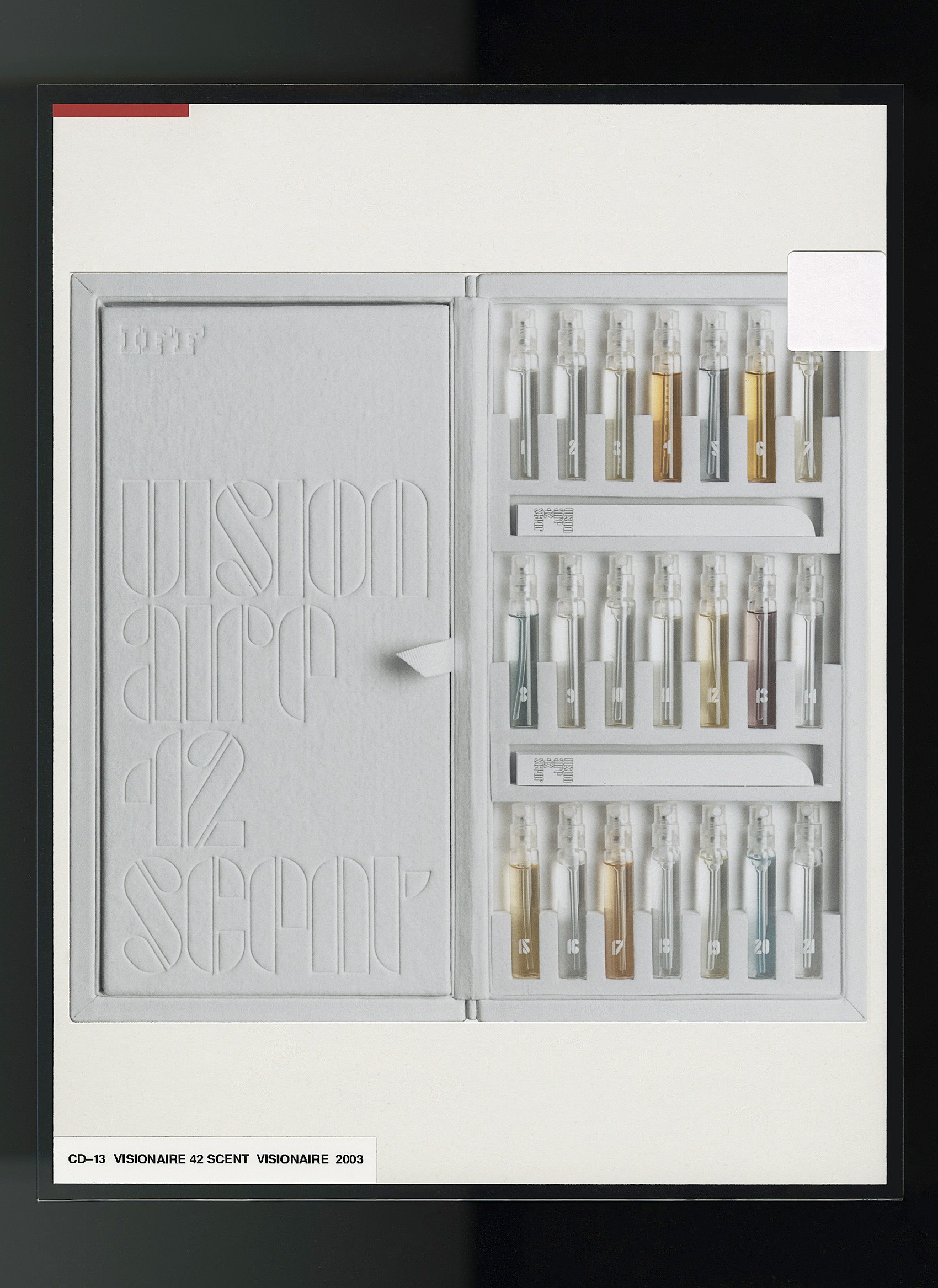
Similarly, Visionaire's Scent issue13 contains 21 perfume vials paired with 21 photographs. Artists contributed an image which they then assigned a corresponding scent.
CD
When we worked with , she chose 'softness', a very sweet and powdery scent. She took a portrait of this girl in a white dress which was super ephemeral and atmospheric. It looked very sweet and powdery. It was interesting, because it was not what you typically associate with her work. I associate her with quite stern, militaristic formations. This was the first time she was doing a photo project for us.
NR
Occasionally, you invite fashion designers to guest edit issues of Visionaire. Tasking them to experiment outside the realm of clothing, and interpret their aesthetic through layouts, art, and photography. When collaborating with a designer how does their vision manifest in the form of a publication?
CD
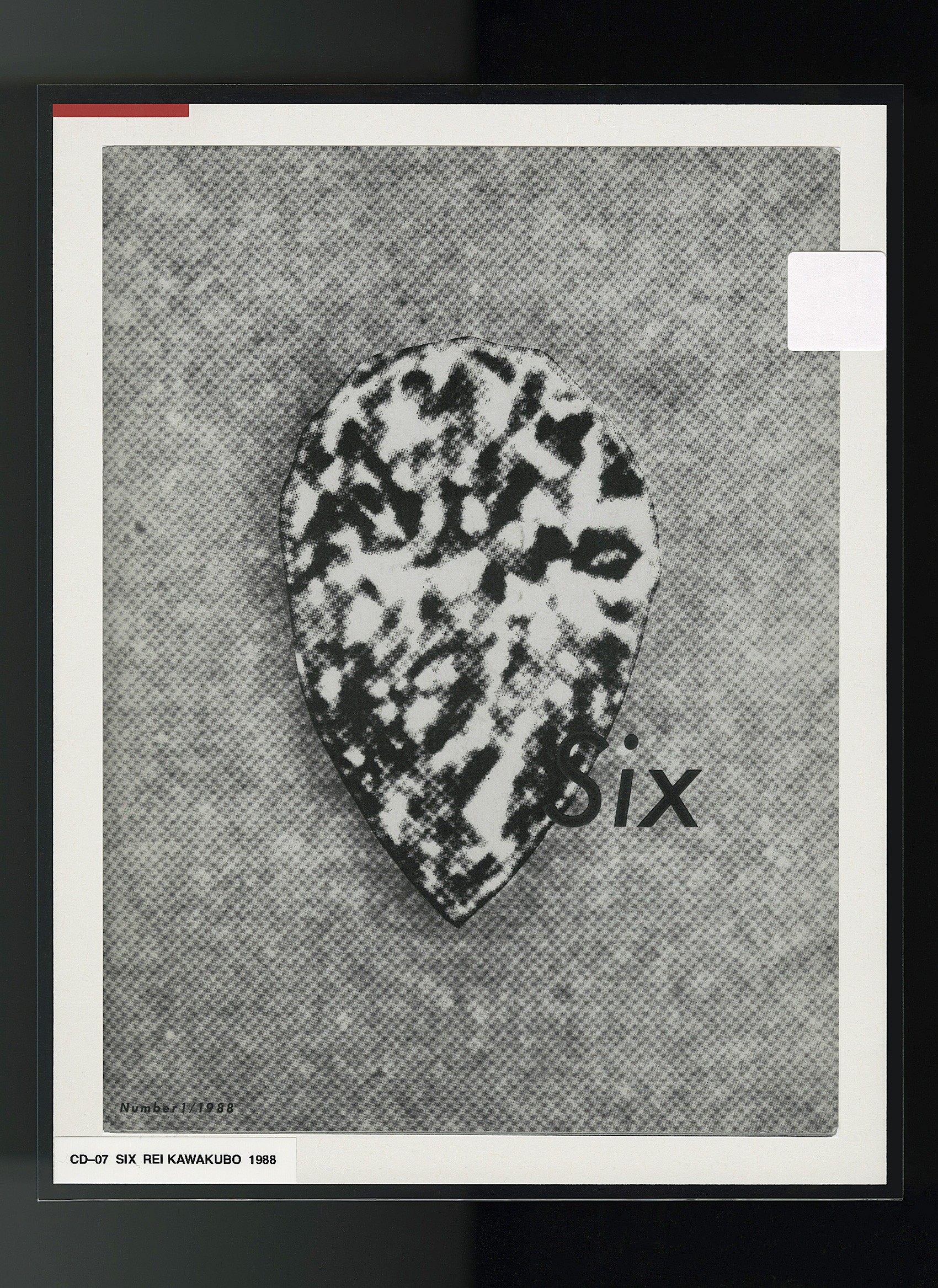
We've worked with very visually-driven fashion designers who have other interests outside of fashion and apparel, like , , , and —they each had a very specific vision for what their issue would communicate about themselves as people and as a brand. Rei Kawakubo hand-selected each look to shoot. Tom Ford emphatically dictated, 'no fashion'. Hedi Slimane wanted a precise grayscale to work within. Riccardo Tisci drew inspiration from his strict Catholic upbringing. They are all generously revealing the inner workings of their creativity process.
In 2002, Hedi Slimane was like, 'it's all about gray and electronica' because the aesthetic was very music-driven, actually. For our , he proposed his own vision of Paris as a city of the future—challenging our tendency toward associating it with the baroque. It served as a testament to his redux aesthetic and an exploration of a new movement: computer art. The issue contained minimal monochromatic scenes completely devoid of human form and ornament.
I remember showing Hedi a photo that was literally a grayscale photo of a corner of a room. Nothing there—only a shaft of light coming from a window you could not see. And he looked at the image and said it was too human. I guess because it was a real shaft of light, and his whole idea was about computer-generated images.
The entire concept really had nothing to do with clothes. But if you look at his first Dior Homme show, you see the minimal line and gray palette. It’s the same vision; different ways to communicate it.
And Riccardo Tisci in 2011 was the opposite aesthetic. He tackled the concept of religion, which was driven by his very strict Catholic upbringing in small-town Italy, where he was gay and wracked with guilt (not that you would know by looking at the issue that it is autobiographical). He has a very specific definition of religion: it is dark, sexual, verging on S&M. And you could see these references at play in his clothes: dark, severe, covered, revealing, and all on strong women.
NR
As someone who has pushed all conceptions of what is understood as publishing—what is your definition of publishing?
CD
I've always defined publishing as 'sharing images'. For us, Visionaire is image-based, so it's a format where you can share images that could be any medium, really. So publishing to me isn't necessarily ink on paper.
You know that question first came up when we did our toys issue in 2004, because up until then, we had been doing variations of ink on paper (with a couple exceptions). Visionaire 44 TOYS and 45 MORE TOYS featured illustrated characters on 3D plastic molds. I remember we got so many complaints from our subscribers. They were like, 'this isn't publishing'; we’re 'book collectors'. And I responded 'no, this is still publishing; it just so happens it’s not ink on paper, it’s ink on a piece of plastic, what's the difference?'
Publishing is this constantly evolving word, because I feel like the only definition is to share with an audience.